Personal Branding Logo
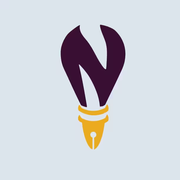
A logo for my own brand: a light bulb shaped like the letter N, with a pen nib as its socket, joining ideas and craft.

Overview
I designed this logo to be the mark for my portfolio and my professional identity. The bulb is shaped like the letter N for my name, and the pen nib forms the socket. Together they stand for what I do: turning ideas into websites and visuals, and getting them noticed.
The challenge
I wanted a logo that says something about me instead of being a generic icon. It had to stay recognizable at small sizes like a browser tab or a profile picture, work on light and dark backgrounds, and feel professional without losing personality.
The concept
- The bulb: ideas and creativity, and the starting point of every project
- The letter N: my initial, built into the shape of the bulb to demonstrate my adaptability
- The pen nib: writing, design and craft, and it sits where a bulb's socket would be
- Together: an idea (bulb) made real through craft (nib), which is the kind of work I want to do
My process
-
Brainstorm
Listed words that describe me and my work, such as ideas, writing, design and marketing, and looked for objects that stand for them.
-
Sketch
Drew rough versions of the bulb, the N and the nib, and tested ways to combine them.
-
Refine
Built the chosen sketch as a clean vector in Illustrator and adjusted the shapes, spacing and colors.
-
Test & apply
Checked it at small sizes and on light and dark backgrounds, then used it on my website and in mockups.
Color choice
-
Deep purple
#3B0F3A -
Warm gold
#F2B705 -
Very light blue
#DDE3E8
Purple feels creative and confident, and gold gives a spark of light like a lit bulb.
Gallery

Result & what I learned
The final logo is the mark I use on my portfolio and I plan to use on my resume and social profiles. I learned how to turn a personal idea into one clear symbol, how small details change how a shape reads, and why a logo has to be tested at small sizes and on different backgrounds.